1. The color of the P50 bill, PINK, is highly similar to the P20 bill, ORANGE when seen in underlit situations;
2. The new five-peso coin has the same size as the one - peso coin so that one could lose five pesos when paying the jeepney driver for the ride;
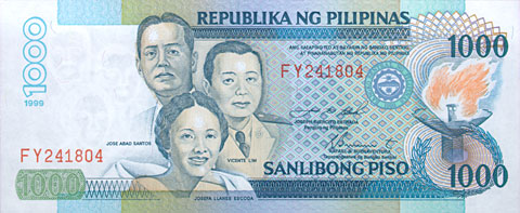
3. The one thousand bill is blue while the one hundred is violet -- not much difference in hues unless one is a painter or visual artist who has to deal with colors all the time;


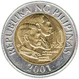
4. The ten-peso coin is the same size as the one peso coin and has the same silver color.
Why is the Bangko sentral coin and peso designer acting this way? Does he or she delight in seeing people quarrelling on what coins or bills are being paid?


Is there an intentional move to confuse the public in their financial transactions?
What kind of mindsets should be handling the design of our money?
I think this is a grave misgovernance to muddle our people's thinking about money and make us poorer all the time.


No comments:
Post a Comment